As a Science postgraduate student, we often
encounter the following question from our supervisor, “Where is the error bar
in your graph?” Error bars are a graphical representation of the variability of
data and are used on graphs to indicate the error, or uncertainty in a reported
measurement [1].Error bar
is important especially to represent your findings in an article, for example:
Adapted by permission from Macmillan Publishers Ltd: [NATURE] (Dalladay-Simpson,
P., Howie, R. T., & Gregoryanz, E. (2016). Evidence for a new phase of
dense hydrogen above 325 gigapascals. Nature, 529(7584), 63-67. doi:
10.1038/nature16164
The values of Time (min) and Average Temperature (ᴼC) for the following example were taken from this video. Time
(min) is independent
variable (IDV) while Average Temperature (ᴼC) is dependent variable
(DV). The following Step By Step creating error bar in graph was done by Microsoft Excel 2013 (the steps
may vary for different version of Microsoft Excel)
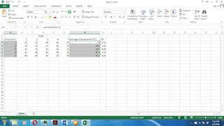
Average values were calculated by =AVERAGE(XX:XX)
formula:
Standard
deviation values were calculated by the following formula: =STDEV(XX:XX):
Highlight the values in the Time (min) column:
Now while hitting CTRL tab continuously, highlight
Average Temperature (ᴼC) values:
Release the CTRL tab after two columns - Time (min) and Average Temperature (ᴼC) are highlighted:
Click INSERT > CHART > Scatter. You will see your scatter graph created:
Next. Click Design > Error Bar > More Error Bars Options…:
ERROR BAR option on the bottom left of your excel
sheet. Scroll down by using the far left tab (as in green
circle), and check Custom and click Specify Value (red rectangle):
When Custom Error Bar box pop up, delete “={1}” in Positive Error Value and Negative Error Value by using <-BACK SPACE tab:
Now, click on the small icon (as shown by red arrow) :
After that, highlight S.D. values, and click on icon (as shown by red arrow):
Repeat the same procedure for Negative Error Value, and hit OK:
Next, click on one of the HORIZONTAL error bar in the graph (as shown by red arrow):
ZOOM IN :
References:
2. https://youtu.be/2Etko-slowk
3. Dalladay-Simpson, P., Howie, R. T., & Gregoryanz, E. (2016). Evidence for a new phase of dense hydrogen above 325 gigapascals. Nature, 529(7584), 63-67. doi: 10.1038/nature16164
3. Dalladay-Simpson, P., Howie, R. T., & Gregoryanz, E. (2016). Evidence for a new phase of dense hydrogen above 325 gigapascals. Nature, 529(7584), 63-67. doi: 10.1038/nature16164
Prepared by,
M. Sc. (Last
updated: 09.01.2016)
DISCLAIMER: All of the information provided by Mohammad Hafiz Bin Hamzah is correct by the time of publishing. All links provided are active by the time of publishing. Mohammad Hafiz Bin Hamzah will not responsible for any loss or damage caused by using the information in this website.
DISCLAIMER: All of the information provided by Mohammad Hafiz Bin Hamzah is correct by the time of publishing. All links provided are active by the time of publishing. Mohammad Hafiz Bin Hamzah will not responsible for any loss or damage caused by using the information in this website.


